Posts

Showing posts from December, 2016

CODA Basic Instructions

Image
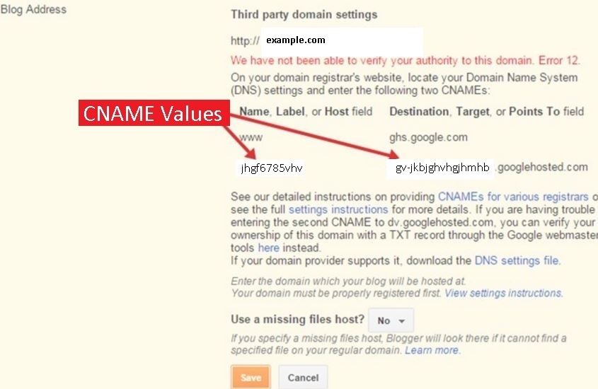
CODA Basic is Adsense ready responsive blogger template. Here are some of the instructions you might need when using CODA Basic. 1. Blog Header. The theme uses a blog header widget which you need to define. You can use text header but a logo based header would look better. 2. Blog Footer. Footer is hard coded in the theme. Go to theme editor and at the bottom of the file you will find <div class='foobar'> inside which there is a table and its content as an linked image and text. You can either edit these content or remove the foobar element all together.  3. Removing/editing header links. Go to edit template, click anywhere in the editor and press CTRL + F and enter "header" without quotes. Just below the header you will find the desired links you wan to edit as shown in the picture. 4. Removing/replacing Ads. There are 2 ad units integrated in the template for easy usage. First is the bill board of size 900x280 and other is the links a

Create a multi-profile badge for your Blog

Image
Check out another version of this profile badge  here .  I just realized that there is no way to add multiple profile's link on your blog. It is either Google+ profile badge or you have to copy your badge code from other sites like facebook in a widget. How about we make a custom badge with multiple links to our different profiles. To do so I am going to use a simple CSS trick to encircle my profile picture and simply add the links to my various profiles. We are making a profile badge which would end up looking like this Step 1. We need to define some CSS for the box and list of profiles. Add following code in your CSS. .profileBadge img {     border-radius: 50%;     width: 150px;     height: 150px;     margin: auto;     display: block;     padding: 5px;     text-align: center;  } .profileBadge li { text-transform: uppercase; list-style: none; line-heigth: 1.4px; text-align: center;  padding: 5px; } .profileBadge{ border: 1

Make your own Blogger theme that you can sell

Image
UPDATE: All of the download links to the final theme are available here .  http://www.shiftescape.com/p/codathemes.html Make sure you go through the instructions properly available here .  http://www.shiftescape.com/2016/12/coda-basic-instructions.html I have always had a love for web designing.  At first I used to make themes for WordPress now that I have moved to Blogspot I decided to make a Blogspot theme that I can customize as I like. In doing so I thought why not make a theme that everybody can customize, rather I decided to make a free version and write up my progress from start to end. I did all that yesterday as I made  CODAthemes . You can follow up the progress from the last post that was written, or I am summarizin everything here for ease. If you are not much of a reader you can simply download the final version and do as you like from here . Step1. At first we made a dummy template, here . Step2. We added a CSS for post images in our blog, here .

Finishing up our First Blogger theme

Image
I used this for my sidebar. .sidebar li {     text-transform: uppercase; list-style: none; line-heigth: 1.4px; } .sidebar h2 {     font-size: 14px;     font-weight: 400;     text-transform: uppercase;     margin-left: 30px;     margin-top: 30px; } .sidebar .widget {     font-size: 12px; } Of course you are free to play around with whatever you like. Also I have added CSS to make a read more button at the home page as follows. .readmore a {     padding: 8px 15px;     text-transform: uppercase;     background: #333;     color: #fff; } .readmore a:hover { color: #FFFFFF; text-decoration: none; } Then I defined a little CSS as .post-footer{     padding: 18px 22px 10px 22px;     background-color: #f5f4f4; } .primary h3 {     font-size: 2em; } Now the post-footer part is the one where "Posted by eff on 12/12/16 ..etc" is written. This is done to distinguish it from the post content. And I just resized font in the title on home page. With this I conclude my blank template. It will

Making the homepage more attractive and simple

Image
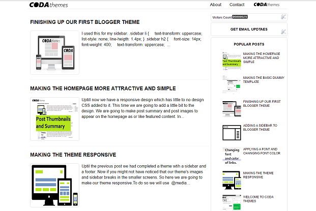
Uptill now we have a responsive design which has little to no design CSS added to it. This time we are going to add a little bit to the design. We are going to make post summary and post images to appear on the homepage as or like featured content. In short we are going to make post thumbnails, and summary for our home page. To do this I took help from this  post. To do this we use a Javascript that uses the first image in a post and creates an excerpt which then is shown. To do this search for <data:post.body/> There are only 2 occurrences of this in our theme. Replace the 2nd occurrence with  <b:if cond='data:blog.pageType != &quot;static_page&quot;'> <b:if cond='data:blog.pageType != &quot;item&quot;'> <div expr:id='&quot;summary&quot; + data:post.id'><data:post.body/></div> <script type='text/javascript'>createSummaryAndThumb(&quot;summary<data:post.id/>&quot;,&quot;&

Making the theme responsive

Image
Uptil the previous post we had completed a theme wtih a sidebar and a footer. Now if you might not have noticed that our theme's images and sidebar breaks in the smaller screens. So here we are going to make our theme responsive. To do so we will use  @media (min-width: 1200px) .container {     width: 1040px; } This is used for the browser to distinguish which CSS is to be used. We will simply add  @media (min-width: 1200px) to our container, body, main, sidebar and if you are using my version primary and secondary tags instead of main and sidebar respectively.   I used this @media all and (min-width: 1020px) and (max-width: 4080px){ .container { width: 1020px; margin: auto; } .primary{ width: 70%; float: left; } .secondary{ float: left; width:30%; } }/* media all and (min-width: 800px) and (max-width: 1020px) */ @media all and (min-width: 800px) and (max-width: 1020px){ .container { width: 800px; margin: auto; } .primary{ width: 70%; float: left; } .secondary{ float: left; width:3

Adding a sidebar to Blogger theme

Image
Now that we have a template that shows posts properly, we need to setup the sidebar. Also we are making a responsive design here we will be ensuring that page doesn't breaks on different browsers and devices. In previous versions of the Blank template you must have noticed that we added a footer and sidebar module to our theme. And you would have probably noticed that you can add the widgets to this area. Now all we have to do is to take this module and show it to the right of our theme so that it appears like a sidebar. Now if you look back to our code, the module was  <b:section class='sidebar' id='sidebar' showaddelement='yes'> I removed other parts since this is our concerns with. This part has the class 'sidebar' being used. So we are going to define this sidebar in the CSS section.  To do so add this. #sidebar {     float: left;     width: 30%; } Now our sidebar is ready. But this doesn't really do anything and our sidebar doesn'

Applying a font and changing font color

Image
Previously we had made a blank blogger template which can show the images in the post properly in any device, we fixed the head section not showing the page title in the tab. Now we are going to change the font and font colors for our little theme. For this we will add the font in body section in CSS. body { font-family: Roboto,sans-serif; font-size: 14px; line-height: 1.4; } Of course you can use any font as you like. Just make sure it is supported everywhere or there is no use of defining it. Now we need to set a particular color for our links. So that it doesn't look low quality with visited and not-visited links in your blog. For this we will add this: a, a:hover { color: #000000; text-decoration: none; } a:focus, a:hover { text-decoration: none; } again you are free to mess around with. You can download the blank template from below. Download link: https://drive.google.com/open?id=0B8Qb2-H0P8xIRnpmUllpRXViTFU

Blank template Update One HEAD section fixed

Image
So this is the round up of this session for now. I will get back to this after some hours and a game or two of DOTA. In previous to previos post the theme we made had no title defined in its head section. Download this version for the HEAD section fix and images width defined. Download link:  https://drive.google.com/open?id=0B8Qb2-H0P8xIclhuOFZkOFhWRlE

Setting up a logo and images size

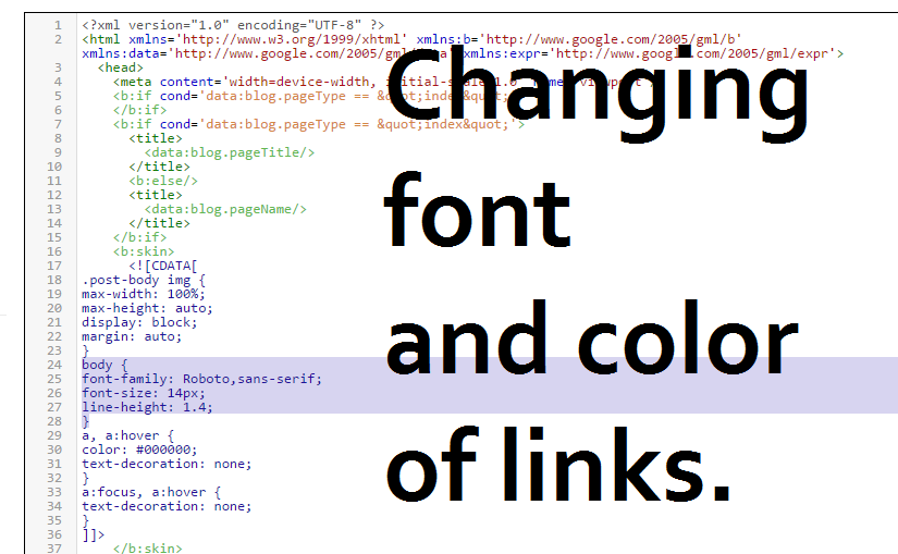
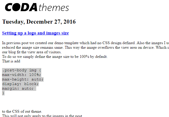
In previous post we created our demo template which had no CSS design defined. Also the images I used in the post were considerable big which I did on purpose. Now when the screen size is reduced the image size remains same. This way the image overflows the view area on device. Which is not acceptable when making responsive designs. So we are going to make the images in our blog fit the view area of visitors. To do so we simply define the image size to be 100% by default. That is add .post-body img { max-width: 100%; max-height: auto; display: block; margin: auto;  }     to the CSS of out theme. This will not only apply to the images in the post. 

Making the basic dummy template

Image
UPDATE: Please read this . There is a much better and updated version of this blank template. If you are not much of a reader, use this link for download . Basic template for Blogger template development. This is a basic and plain blogger template with no design or customization added. You can use this as a base for developing your own blogger template. With main post, sidebar and footer widget area and fixed HEAD section download link:  https://drive.google.com/open?id=0B8Qb2-H0P8xIclhuOFZkOFhWRlE With main post area only download link: https://drive.google.com/open?id=0B8Qb2-H0P8xIN3NFWFhNQzNTY0k Blank template with footer and sidebar widget area download link:  https://drive.google.com/open?id=0B8Qb2-H0P8xIRnpmUllpRXViTFU I am not making any demo page for this theme since it is complete plain. It should look something like this photo when applied. With your content of course.

Welcome to CODA Themes

Image
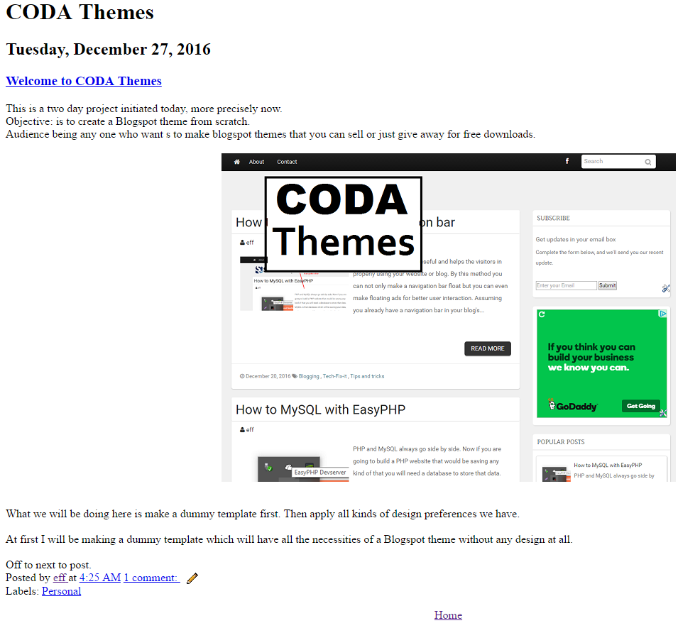
This is a two day project initiated today, more precisely now. Objective: is to create a Blogspot theme from scratch. Audience being any one who want s to make blogspot themes that you can sell or just give away for free downloads. What we will be doing here is make a dummy template first. Then apply all kinds of design preferences we have. At first I will be making a dummy template which will have all the necessities of a Blogspot theme without any design at all. Off to next to post.

How to make a floating navigation bar

Image
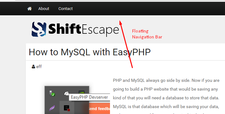
Navigation bar are really useful and helps the visitors in properly using your website or blog. By this method you can not only make a navigation bar float but you can even make floating ads for better user interaction. Assuming you already have a navigation bar in your blog's theme. Go to the CSS of your theme. If using WordPress, go to stylesheet.css in the editor. If using Blogger, go to edit template and find the CSS of your navigation bar. Use inspect element tool in Chrome and Firefox to correctly identify your navigation bar's CSS. Now simple add position: fixed; width: 100%; to the CSS of your navigation bar. Actually the width part is optional and you might have to do some hit and trial for your navigation bar to look right. How it works? It in the position part. When we set the position at FIXED the browser will keep the navigation bar's position at one place even when the page is scrolled through. 

How to MySQL with EasyPHP

Image
PHP and MySQL always go side by side. Now if you are going to build a PHP website that would be saving any kind of that you will need a database to store that data. MySQL is that database which will be saving your data, and to access, modify or save data in this database you need SQL which stands for Structured Query Language. Now if you are aware of the previous post  we are going to use EasyPHP for our work here as well. Considering you have installed and configured EasyPHP from previous post . Lets get started with MySQL. 1. First of all open the EasyPHP dashboard by right(or left) clicking the EasyPHP tray icon. 2. Now click on Start under Database Server to start a database server. 3. If you find multiple option go with any I went with the first. And click on start. 4. Once started we need to run queries. To do so we need PHPmyAdmin. Go to the  EasyPHP dashboard again and there you will find MySQL Administration PHPmyAdmin as shown. 5. Upon opening you will

How to install and configure EasyPHP

Image
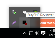
If you are going to learn PHP programming you will need to run a server that hosts your PHP pages. For doing this there are multiple ways. All of them are nothing but server applications that run an Apache server on your system, For some reasons I find installing the Apache server itself bit confusing. But that can be worked around by using WAMP or EasyPHP. If you are getting "msvcr100.dll missing" error see this . 1. Going with EasyPHP download the latest EasyPHP Dev Server from their official site, here . As of writing this the latest is 16.1.1 2. Go with the default installation. Which will install in the directory of your windows. 3. Once installed you will see an EasyPHP tray icon as shown. 4. Right(or left) click the tray icon and click Open Dashboard. Which will open up a page in your Web Browser as shown. 5. Once we got the all we have to do is start the service we need. Since we want make PHP pages, click start under HTTP SERVER. If there are multiple ch

Fix msvcr100.dll missing for EasyPHP Windows 10

Image
The main root of this problem is the missing  Microsoft  Visual C++ environment. Now one way to fix it is by downloading the  Visual C++ Redistributable one by one of different releases. Which did not work for me.  After having numerous retries and reinstall I decided to download the Visual Studio itself which actually solved my problem. Actually the problem was that I am using an AMD based system and using the auto-installer of Visual Studio it automatically downloaded the desired files.  Download Visual Studio from the official website . It comes with an installer. It fixed my missing dll files mid way through.